Case Study - Creating our customers perfect dining room
Written by Sophie Clemson
In this week's blog we tell you how we transformed a tired dining room into an inviting, cosy and modern space. We will take you through the steps we took along the way and hopefully you will agree it is now a great place to entertain guests and to enjoy as a family.
Becky and I have been designing several rooms for a lovely family in Northumberland. We began working together last year with their living room and have been lucky enough to continue with other rooms in their new build home. After purchasing everything we suggested, their dining room is nearly complete and we want to share this design with you.
When we began discussing how the dining room should look and feel our customers really wanted to create a flow from their gorgeous living room space which we had previously designed for them. In the living room we previously used a neutral colour palette, paired with beautiful textures to create interest and it had a relaxed modern country feel. It was important for the dining room to have continuity with the living room as you can see the room from lots of different angles due to the layout of the downstairs area.
The dining room is used daily by the family. They have young children who love to eat at the table and a lot of time is spent in this room. The dining room is also a place they love to entertain guests therefore it needs to be practical whilst still having that warm, cosy and inviting feeling. They knew they wanted the room to have a rustic country feel whilst still being modern with on-trend pieces that have longevity.
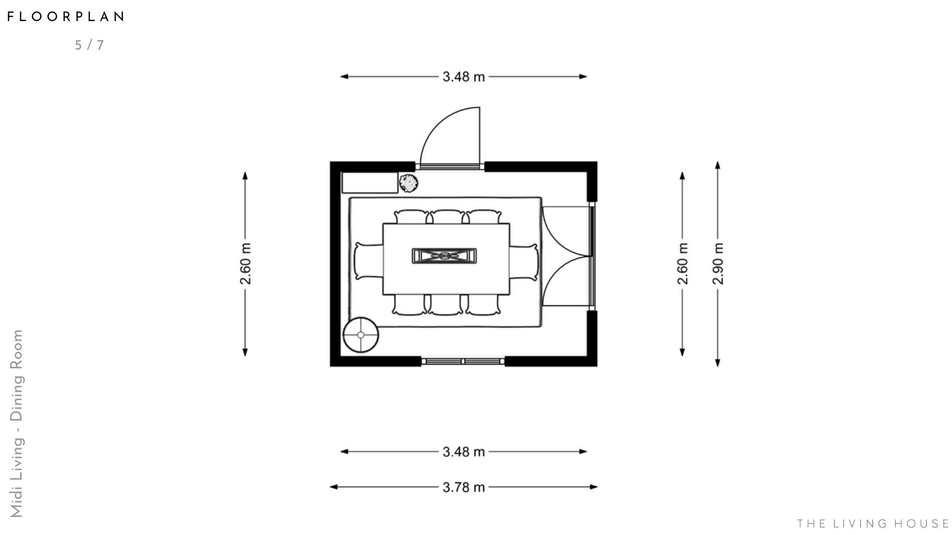
The layout needed to be considered carefully before choosing any of the main pieces for the room such as the table and chairs. The room was less than 4m wide and only 2.6m long and our customers ideally wanted to seat up to 8 people at the table. Whilst this was possible, we needed to take extra care to not overcrowd the room with furniture that was too big. We looked at different size tables and chairs and even considered the types of legs on tables as the leg positioning had a huge impact on how many chairs could tuck underneath the table.
Once we knew what size table and chairs would work, we of course in TLH style had to see what size rug would be suitable (if you didn’t know already we love what a rug can do to a space and always try to add one into our designs if we can!). We went large with the rug at 275cm x 185cm. It was just the right size to sit underneath and zone the dining table without getting in the way of the double doors which lead you into the room. Top tip - Go large! The larger the better when choosing a rug, if you go too small it can look like it is floating. Opting for a larger rug can make the space feel bigger too!
We can shop from anywhere to suit your style and budget. Click here to get started.
In the layout planning we wanted to add some height to the space. We placed a bookcase in the corner with a large plant and we could see from the floorplan that this bookcase needed to be slim at only 30cm depth. Storage wasn’t really needed in the dining room however it is always important to use different heights in furniture to create interest and draw your eyes to different areas of the room. As our customer wanted the room to feel cosy and inviting we placed a floor lamp in the opposite corner which adds a layer of lighting and is great to have on in the evenings to give the room a glow in the downstairs of the house.
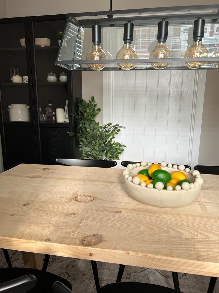
With the layout decided and furniture dimensions chosen it was time to move onto selecting pieces for the room that would create interest and style. We knew that the customer wanted a chunky rustic yet modern dining table, therefore we chose the lovely Sherwood design from Livs. This Canadian pine table was a great option as you can choose a bespoke size and finish. We love the trestle A frame table which has that contemporary farmhouse look - which was perfect for this scheme. We wanted the room to feel contemporary so we decided to include two different chair styles around the dining table to add interest. We chose some wooden spindle dining chairs from John Lewis to bring that country look to the room but went with black for a more modern finish. These chairs were also a great choice for a smaller room as you can see through the chairs which makes the room feel more spacious.
Top tip - Furniture that you can see through gives the illusion of more space and works brilliantly in smaller rooms. To complete the seating we selected two upholstered dining chairs from Dunelm in a natural fabric for each end of the table. The chairs have a lovely curved back with black legs and tied in really well with the spindle chairs. They helped give a formal edge to the room whilst still having that family casual dining room feel.
The next step was finding the rug. As mentioned we opted for a large rug that would fit well under the dining table. With this being a space that is used daily we wanted to give our customers a durable rug whilst still being stylish of course! We chose the beautiful Karman ivory rug from Ruggable which brings in a hint of subtle colour and pattern. If you didn’t know already Ruggable is a company that specialises in rugs that can simply be washed in your washing machine at home, perfect for families or high traffic areas. The rug has a gorgeous antique style print that works so well with the rustic wood dining table and black finishes in the room. It blends traditional and modern style in this transitional pattern (if you’re a ‘dream home makeover’ fan then it is very Studio McGee!)
Need help with the finishing touches? Click here - our Mini Living package is perfect for you!
Lighting is so important in every room we design, it can really make or break a room. Our customers were keen on creating an atmosphere in this room and wanted it to feel warm and inviting. We always recommend adding layers of lighting for a cosy atmosphere, therefore placing a floorlamp in the corner worked perfectly to give a soft glow. The floorlamp we chose from west elm picked up on the black from the dining chairs and added warmth with the brass. The ceiling light is directly above the dining table, there was an opportunity here to create an eye catching feature within the room. Our customer had already shown us in their inspiration images a lantern style pendant therefore we opted for a modern 5 light black lantern. This works so well above the dining table and complements beautifully with the modern country vibes.
The final piece of furniture in the room is the bookcase, which added the height the room needed. We had chosen the well known Billy bookcase from IKEA. The Billy design in black with the glass door looks so much more expensive than you might think and just worked so well. It is a fabulous place to display a few accessories which we picked for our customer such as; a cream ceramic vase, a small succulent for some greenery and a beautiful amber glass vase. We carefully picked a few pieces with terracotta tones to introduce a small amount of colour and add warmth.
To complete the simple yet effective styling of the room we chose a beautiful large ceramic bowl to be placed in the centre of the dining table. We filled the bowl with artificial lemons and limes which are perfect for the summer months.
Rather than designing the room with a feature wall we suggested our customer paint all the walls the same. As the width of the room is 2.6m we felt a feature wall would make the space feel smaller and every other wall had either a window or door which would have looked too distracting and busy with a wallpaper. We chose a beautiful colour by Little Greene - Rolling Fog 143, it is a lovely warm neutral which keeps the room feeling light whilst still having a cosy feel giving the room depth. Top tip - if you’re painting a room in an off-white/neutral colour paint the ceiling too, it blurs the edges and can make the room feel bigger too!
As we decided against a feature wall, we still wanted to create an impact therefore we selected a simplistic piece of artwork, however we went large! The artwork being quite large meant it would draw your eye into the room and create interest without making the room feel too busy. We went for a neutral abstract design with a hint of lovely rich terracotta tones.
Our customer already had white venetian blinds in the room which worked well with our design. To add to the window and build on that cosy and inviting feeling we added some beautiful linen curtains from The Secret Linen Store. These perfectly framed the window and softened the lines of the window frame, adding to that relaxed country feel.
Our customers wanted to create a dining room which had a relaxing, cosy, modern country feel to it. A room perfect for entertaining guests whilst still being a lovely dining room to sit down and eat together as a family. We absolutely love how this beautiful tonal neutral scheme came together with its rustic textures and contemporary finishes which nailed our customers' brief. They were delighted! Now that they have completed the room, with only the large artwork to be hung, we have shared the before and after photos below.
And if we do say so ourselves…it looks amazing!
Here is a snippet of what they had to say after receiving their design:
“Thank you so much ladies!! I’m ordering now!! I think it blends with the kitchen and the living room perfectly!!”
Before
After
After
After
After
After
If you would like some help updating your home, please get in touch here. We’d love to hear from you and create a beautiful scheme personalised to your style and budget.
You might also like
Online Interior Design - is it right for you?
Case Study - Open Plan Kitchen/Dining/Living Room
Choosing the Best White Paint Colours for Your Home


