Using murals in your home
Written by Catherine Seagrave
Murals have been a way for people to decorate their walls since the time of the caveman. Thankfully these days we’ve moved beyond scenes of stick men catching woolly mammoths! With new technology you can have an easy peel and stick image of almost anything to perfectly fit your wall.
A large-scale mural may feel like a bold addition to your room, but it needn’t be scary if you strike the right balance. With eye-catching patterns, prints, and colours, it has the potential to add masses of personality and can give you an instant shortcut to create a dramatic design statement.
We can shop from anywhere to suit your style and budget. Click here to get started.
Murals have been increasing in popularity in recent years. Their ability to provide a touch of escapism and fun to our homes has never felt more relevant. Our desire to get closer to nature and travel can be seen in our choice of mural design where the depth of colour and detail can take us to far off lands.
If you are looking for a focal point in your room, you can find a mural of almost anything from abstract patterns to huge florals, minimalist drawings to misty forests and cityscapes… the list is endless. Want to give it a go? Read on for some pointers on how to get it right.
What should you consider before getting a mural?
The first thing has to be what you feel you can live with every day! A mural can be very trendy but are you comfortable with it for the long term? Think about your mural choice carefully and imagine its presence in your home. If you are drawn to a large and bold design, maybe tone down the colour choice, or keep the mural to one feature wall so that it doesn’t completely dominate.
Have a chat with us and find out how we can help you. Book a discovery call with us today!
If you do for a larger than life statement design, it’s best to keep the rest of the room quite pared back with clean lines. If the mural is the star, let it shine with less distractions around it.
Although the mural is the focal point, you still want it to sit harmoniously with the rest of the room, rather than fight against it. Use colours in it as a guide for your accent colours. Pick one colour and use it in patches around the room, so that your eye travels. Look for a neutral in the mural and use it in larger quantities to help ground the whole scheme.
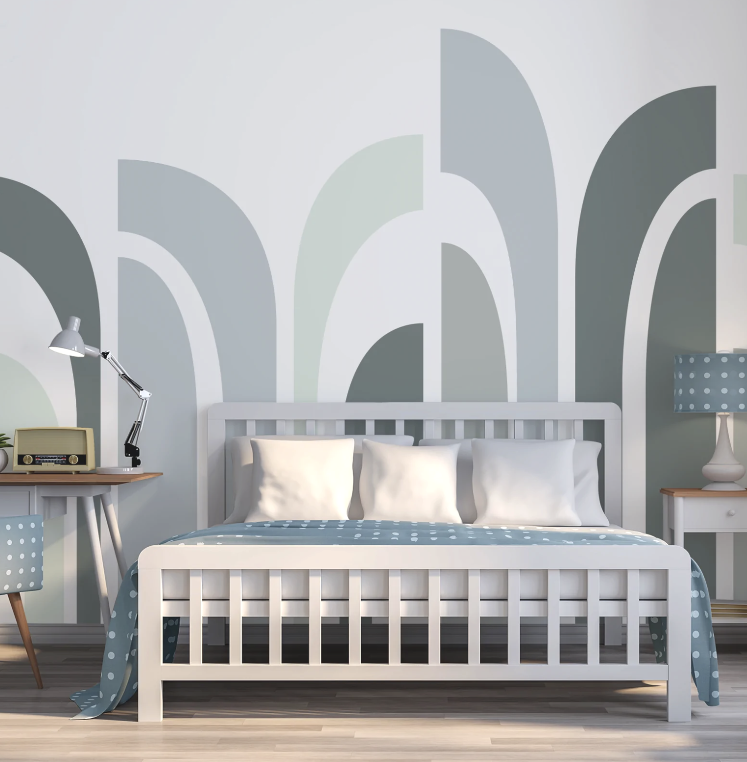
Take a look at where you could add a mural in your home. It usually looks better if it covers the whole wall, or has a natural end point like a pillar that divides the wall. It is also an opportunity to frame an area, maybe a dining nook, or the headboard of the bed. Give the mural something to relate to, and it will fit much better in your interior and make more sense.
Image from WallpaperMural
What are the different options?
There are literally thousands!
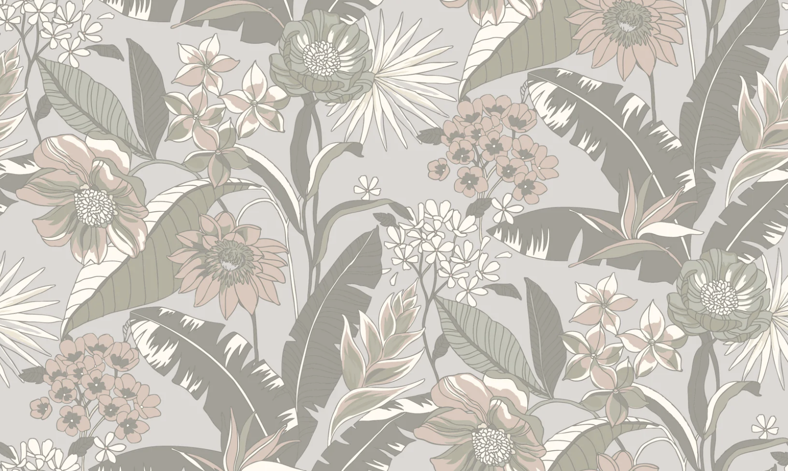
Botanical designs are always popular. From small delicately drawn petals to bold and dramatic oversized blooms, there is something for everyone. Leafy designs remain in demand and feel bold without being overwhelming. They sit particularly well in a room that overlooks the garden and really help to bring the outside in.
Geometric patterns can create a strong impression in the room. When you add it to a more traditional, period interior the mural adds interest and an unexpected twist. In a more modern interior, a geometric mural brings dramatic colour and proportion. An up-to-date take on geometric patterns is using more organic shapes with curved and rounded shapes to bring softness to the design.
Of course murals don't have to just be on the walls. You can take them up and over the ceiling too - or use them just on the ceiling for dramatic effect. Treating the ceiling as the fifth wall can make the room feel larger, removing the hard edges between wall and ceiling and encouraging you to look up.
Murals can be great in smaller spaces too like a bathroom or downstairs loo. These areas can be a bit functional, so it can be fun to add something more decorative and unexpected to these areas. And as it’s not a main area of your home like the kitchen or living room, you won’t have to worry about it overwhelming the space - or you getting tired of it as quickly.
A mural can also be a great addition to a large empty wall that is crying out for a big piece of art. If you centre the mural and frame it, it instantly looks like a painting rather than wallpaper and for a fraction of the cost.
The Living House Mural Collection with WallpaperMural
We love using murals in our schemes as it can bring such vibrancy and interest to a scheme. So when Wallpaper Mural asked us to design some murals with them, we were thrilled! We selected three of our favourite designs and recoloured them for a completely different look and feel.
We love the large scale leaves of this tropical Becky design. We opted for a softer colour palette that still gives the wow factor. Becky would look great behind a dark green sofa to bring a real feature to your living room. The light background keeps it fresh and airy.
The bold botanical pattern of Catherine has a muted, sophisticated feel that would work in many different rooms. Use this mural with a neutral colour palette to really bring your room to life!
Are you overwhelmed by the amount of decisions you need to make? We can help with our affordable interior packages - click here.
We love Sophie for its soft gentle colours and delicate leafy design. The botanical theme has gentle curves and pastel tones to give a calm feel to the room. This mural would look equally great in a bedroom or in a beautiful nursery.
If you would like some help using a mural in your home, we’d love to work it into your design for maximum effect. Get in touch with us now to get your project started! And you might be surprised at just how affordable our design packages are - starting at only £295! Check out our website www.thelivinghouse.co.uk for more information, and instagram @the_living_house for more inspiration and tips. We’d love to chat to you soon!
You might also like
Understanding our 6 step interior design process
How to bring the Scandi style into your home
Hanging Curtains? Avoid making these mistakes


