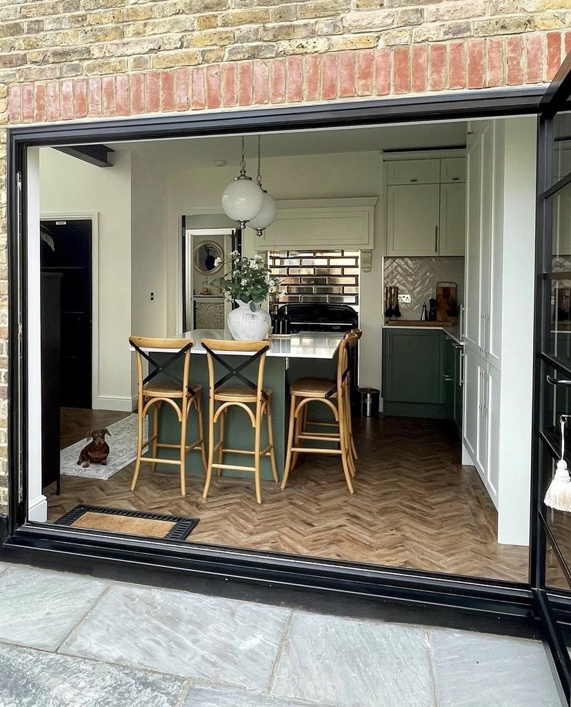
The 6 most common mistakes we see when you extend your home
Written by Catherine Seagrave
Planning an extension or a renovation project can bring up so many mixed emotions - it’s exciting and can lead to your dream home, but it can also feel overwhelming with so many decisions to make and such pressure to get it right!
Over the years we see similar extension mistakes repeated over and over. Undertaking an extension is not plain sailing and it can feel like the project is spiralling out of control quite easily. Costly mistakes can lead to frustrations that you just have to end up living with. Afterwards, most people say that the project was a steep learning curve and they wish they’d know a bit more at the start. But mistakes can be avoided if you plan early, ask yourself the right questions, and know what you need from your home.
We wanted to share some of the insights we have gained over the years, to help you avoid some of the most common mistakes and pitfalls. And give you some pointers to consider - before you get out the sledgehammer!
Mistake 1 - Not Considering the Natural Light in the Room
The amount of light in your home is the difference between a light, bright, warm space, and a dark, dingy, cold space. It can make you feel happy in your home, or it can leave you keen to avoid a room. Light is so important that it really is worth considering before you do anything else.
Not all light is equal however, and it has a different feel depending on the direction of your windows. East light is morning light and is quite bright and energising, south light, which is there most of the day can be quite harsh and strong, west light comes in the evening and is soft and warm, and north light gives not much light at all and is cool and dull. Ideally you want to make the most of the south, east and west light as much as you can.
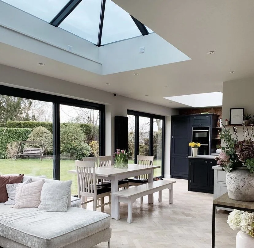
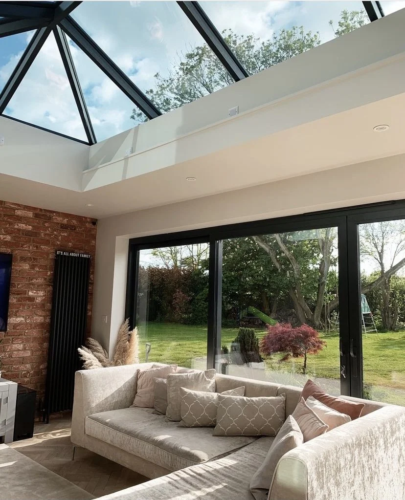
Take a look at where the natural light enters your house. Watch how the sun shifts throughout the day. Consider how to maximise this light in your extension. Where should the windows be? If the room is north facing, are you able to add a window on the east or west side to capture some of this light? Even a small window makes a big difference. If that's not possible, could you add a skylight? Skylights bring in up to 30% more light than a window, flooding the room with light.
Be careful if you are extending on the back of your house not to create dark ‘inner’ living rooms with no direct access to a window. These spaces are better repurposed for utility areas, downstairs toilets, and pantries that don’t need light.
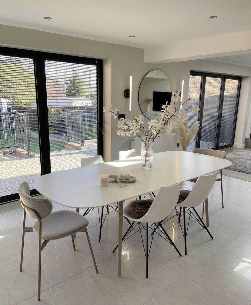
However, having said that, it is also possible to have too much light! You can go overboard on the size of your glass windows and large bifold doors, especially if your extension is south facing. If you add too much glass, you will create a giant greenhouse that feels too hot even in February and is dazzlingly bright, making you reach for your sunglasses!
We agree that the contemporary look of an all glass extension looks amazing on the architect's plans, but in reality it can also feel a bit like living in a goldfish bowl. You have to be prepared for the neighbours to see your every move. We’ve had customers who have spent thousands of pounds on large picture windows only to ask us how to cover them up with blinds as they are too hot and they have absolutely no privacy!
Top Tip - Know the direction your room faces and maximise the light you have, ideally making the most of morning and evening light with windows on different aspects. Be wary of very large windows that will compromise your privacy, especially if they are south facing as it will also make the room very hot!
Are you overwhelmed by the amount of decisions you need to make? We can help with our affordable interior packages - click here.
Mistake 2 - Going Too Far…
A very common mistake we see is people knocking down too many walls. We’re all for an open plan space but sometimes removing a wall just doesn’t add anything. A customer we worked with recently had knocked out the whole back of the house, extending and creating a huge kitchen family room. However, to remove so much wall, they had to leave a large supporting pillar in the middle of the space. This made it difficult to arrange furniture because it was completely in the way and dictated the way the room could be zoned. In this instance it may have been better to leave one of the walls in place to divide the room, rather than having an awkward pillar.
Top Tip - Before you start knocking walls down try to uncover the true problem with your current home and look to find a solution. It’s not always just more space that’s needed. What doesn’t work at the moment and why? What does your family need from the new space? Who will use it and how? Asking these questions can help you know what you really need - and if that wall should stay!
Mistake 3 - …Not Going Far Enough!
However, having said that, another very common mistake we see is not going far enough. It’s such a shame when we think, if only they’d gone that bit further, the room would have been transformed! And let’s face it, after living through months of building work, you are very unlikely to make those changes at a later date.
It can be really difficult to see beyond what you are used to though, and see how you can unlock the potential in your home. Try not to get stuck seeing only what is already there, and limit your imagination by the existing floor plan.
Recently we helped a customer who asked for our help early in the renovation process. She had consulted with her builder and a few kitchen designers and although they were taking a wall down, the footprint of the kitchen remained the same. It left a kitchen still pushed into the corner, not making the most of the garden, with lots of doors to the utility room, pantry and downstairs loo complicating the space. After chatting to her and understanding the family’s needs, we suggested changing the access to all these utility areas, allowing for the kitchen to be swung around 90 degrees, and opening up the area to include a big sociable island and a lovely table with views to the garden. If this customer had just taken the wall down and updated the kitchen in its original configuration, she would have missed out on the opportunity to create the really sociable, wow looking kitchen that she now enjoys!
Top Tip - Don’t just accept the first idea that your builder or kitchen designer offers. Get advice from someone with vision who will ask you the right questions and look for solutions you may not have considered.
Are you struggling with the layout in your multifunctional room? Click here our Maxi Living package is the perfect solution!
Mistake 4 - Not Considering the Flow
When planning an extension, people can often focus so hard on the transformation of this one area that they forget to consider how it fits with the rest of the house. This can result in disjointed spaces, and awkward angles and corridors where the new meets the old. You don’t want to end up with rooms that are just a walk through to the extension as they will become a dumping ground for the laundry and that exercise bike!! Consider the impact the extension has on the old house and these transition points, and how they will flow together. What is the best use for these old rooms?
If you are altering the layout to become open plan, make sure there is still a clear path through the area. Even if the room is large, it will feel cluttered and annoying if the door hits the back of the sofa or the barstools are too close to the dining table chairs. Look at the access points in and out of the room and sketch it out on a floorplan. Draw lines where you are likely to walk to the oven, fridge, sink, doors in and out, utility room etc and make sure these lines are kept clear of furniture.
Top Tip - Consider how the new area will fit with the old and the impact it will have. Look to create a flow around the spaces by knowing the most congested areas and the traffic flow to make it feel as large and airy as possible.
Mistake 5 - Not Planning Your Time
Oh, this is so common and leads to so much stress! And this is often the point where customers ask us for help (ideally it would have been much earlier!). Once the project is underway you will be asked for decisions on absolutely everything - and probably way before you’ve had time to consider it properly. Electricians want to know where your lights will go very early on, what’s the exact position of your dining table, how many lights will you have over the island, how many circuits do you want, how many sockets and where, decorators will want to know the paint colours of the walls, ceiling, woodwork, the tiler wants to know where you want the wall tiles to start and stop, the plumber will want to know where your radiators should go, and you even have to decide where you want to position the kitchen cupboard handles! And let's not forget the best position for the TV!! The list is endless and you can quickly become overwhelmed, and feel the pressure to make hasty decisions that you later regret - and have to live with.
Top Tip - Make a comprehensive plan as early as possible. If you know how the whole design will come together, the finishes, the position of the furniture, the colour scheme, then you will be ready with the answers before the questions are asked. If this all seems too hard, ask us! We will guide you through the process and take away the stress - so you know you won’t be making bad decisions, and wasting time or money.
Need a bit more help? Take a look at our Maxi Living package here.
Mistake 6 - Thinking Close Enough is Good Enough!
If you want your new extension to work with the rest of your house, then it needs to match what already exists. A common mistake we see is an extension built from bricks that are almost the same design as the original, or flooring that sort of matches if you squint your eyes and look at it in low light!! Don’t settle for an almost match on brickwork, flooring, tiles, paint etc or it will cheapen the look of your extension and make it look a bit shoddy. You really want to have a seamless flow between the old and the new, so do take the time to find an exact match. If that’s just not possible, then it is much better to use something completely different. If you can’t match the brickwork, go for something very contemporary so that the new stands out as a feature. If you can’t match the original wood floor, choose tiles instead so that the difference becomes a design choice.
Top Tip - Choose either to match the old and new seamlessly, or go for a complete contrast. An almost match will only look cheap.
If you’d like some help with your extension project, it’s best to get us involved as early as possible so that we can help you through all the stages. For a multi-function space a Maxi Package is best so we can advise on the best layout options and ensure you get the flow right from the start. We’d love to help you, so get in touch today.


