The top 10 design mistakes to avoid with an open plan room
Written by Catherine Seagrave
Big changes have been happening in the way we want to live in our homes over the last 20 years. I can remember when the only open plan living we saw was Madge Bishop's house on the set of Neighbours!
But our desire for separate rooms for each function has been fading. We started to realise the dining room was seldom used and often became the ‘junk room’, and the kitchen was not a fun place to be, isolated from the rest of the house. So we began knocking down the internal walls, extending into the garden and embracing open plan living. Hooray!!
Many newbuilds now come with open plan living as standard, with the entire ground floor designed to be open. It can be great for families and can enhance our quality of life, with our homes feeling more spacious and the daylight flowing into every corner.
But it can be harder to achieve the harmonious flow of open plan living than you think. Without walls and defined boundaries, the traditional ways we used to decorate don’t work anymore. Where do you now position the furniture? How do you stop it looking cluttered and full of stuff? How do you get the seamless flow that you wanted, with the social spaces and a balance and everything looking effortless and beautiful??
Take a look at the top 10 mistakes we see people making when they have an open plan space. Below are some of the biggest challenges you will need to consider, to help you steer clear of these common mistakes and ensure you achieve a practical and beautiful space that works for you and your family.
Mistake 1 - Not planning how you are going to use the space
This may sound obvious, but you’d be surprised how many people rush into knocking down walls and agreeing to architect and kitchen plans without really knowing how they are going to use the space. And getting it wrong means that the space is awkward and just never works how you need it to. Making changes later on can have a ripple effect as you have to rejig the whole space, resulting in costly changes. And that’s not what anyone wants!
The solution? Spend time early on really thinking through what you need. Every family is different and knowing your particular needs and how you want the area to function at the planning stage is the key to success. Ask yourself lots of questions - how will your family use the space? Do the children need space to play? Do you need an area to work and do homework? How many people will use the room at once? Do you need space for yoga or a piano? Do you entertain lots of people? Do you like to get cosy in front of the TV in the evenings? What do you need to store in the room and what will you need easy access to everyday? It is also important to ask questions at this stage about how you want the space to feel - calm and contemporary or energising and uplifting? To design a successful room you want it to reflect your personality and work for your life stage.
Are you struggling to imagine how it can all work together and get the flow right in your multifunctional room? Click here
Mistake 2 - Not considering the zones
A big open space is great, right? Yes, but you don’t want it to feel like a big church hall! You may have removed the walls, but the functions of the different rooms are still there, and still need clear separation or you risk the empty church hall effect - or worse, a large cluttered confusion in a church hall. Just because you have created one space, it does not mean having only one plan for the whole area!
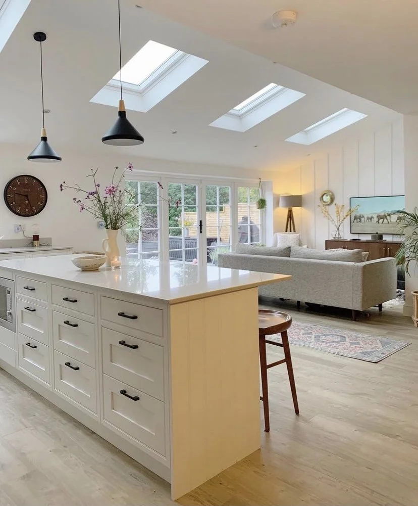
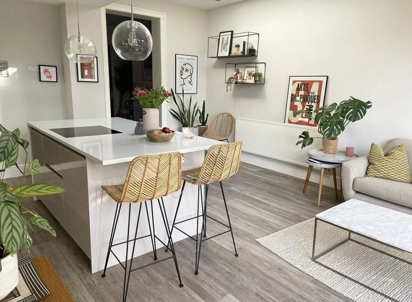
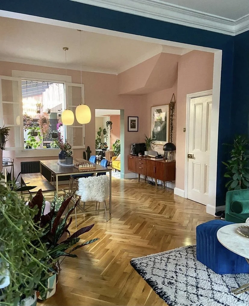
First, start by identifying the different functions in the room - maybe living, dining, kitchen, office. Where there were once walls between these areas you now need to create clear zones, essentially acting like a room within a room with visual continuity. To define these different areas you need anchor points to ground them. You can achieve this with large area rugs, a corner sofa to divide the space, a false ceiling over a certain area, a feature wall, or even lots of plants.
Mistake 3 - Pushing the furniture to the walls
You’ve created a big open space and you want it to feel as big as possible… so you push the furniture against the walls because that leaves lots of floor space and that’s what you did before in the smaller rooms… Wrong! The same rules don’t work in open plan spaces as they did in your smaller enclosed rooms. It will actually make the room feel smaller and sparse, and it definitely won’t be cosy or functional. Poor furniture placement can ruin an open plan space.
Instead, you need to move the furniture into the middle of the room. Leave space between the wall and the furniture so that you can walk behind it. This will instantly make the room feel larger. Create groupings of furniture within the zone with a sofa, armchairs, coffee table and rug. But do be careful not to over fill it. You need the blank space around the zone to make it work. If you start to overfill it, it will feel cluttered and will stop the flow. Start with the basics, add the furniture you need, and then see how much space is left to add any extras.
Do you struggle to visualise how your room could look? Let us help you, click here.
Mistake 4 - Thinking the space is bigger than it really is
Which brings us neatly on to Mistake 4 - thinking the space is bigger than it really is. It may feel like a large space when it is empty but it quickly fills up when you bring in the furniture. Don’t be tempted to cram a dining room, living room and kitchen with a huge island into a space that’s just not big enough. It will leave you feeling cramped and irritated in the space if you can’t walk around easily, or can’t pull out a dining chair without it hitting the sofa.
You need to be realistic about the size of the furniture and keep it in proportion with the size of the space. You want room to comfortably walk around. The best advice we can give is plan it out on paper before you buy anything. Sofas can look deceptively small in a very large shop, and so much larger once it arrives in your home. If you don’t feel confident making a scale drawing, there are lots of free planning programmes online where you can put in the size of your room and your furniture and get a clear idea how it can (or can’t!) fit in the space. Dropping down a size on the sofa from a 3 seater to a 2 seater, and the dining table from a 6 person to a 4 person will instantly make the room feel larger.
Never buy a sofa because it’s in the sale, or you just fell in love with it. Impulse buys rarely work out. Shop with intention and know exactly the dimensions of the items you need. And if it won’t fit - move on. It won’t work no matter how much you love it!!
Mistake 5 - Ignoring the flow
Once the walls and doors are removed in your open plan area, you’ll need to replace the ‘hallway’ and ‘doorways’ with pathways. To easily move around the space you need to know the hotspots in the room - the most used areas and circle them on the floor plan. There are certain points that everyone is going to walk between again and again. Maybe between the fridge and the sofa? The oven and dining table? Look at the high traffic areas and keep them clear. A badly placed side table is going to be knocked over. Or an armchair placed in a thoroughfare won’t feel relaxing as you’ll constantly feel in the way.
Once you have marked out this flow of people (and pets?) on the floor plan, you want to leave these areas clear. Arrange your zones in a way that creates footpaths and easy movement around the room. These footpaths ideally need to be 75cm - 100cm wide to feel comfortable.
Mistake 6 - Mixing the flooring
Sometimes we see people wanting to define the different areas in the room with a change of flooring, using carpet in the living area and hard flooring in the kitchen area for example. Our advice is - don’t! Mixing flooring in this way makes the space feel disjointed and smaller. It’s like drawing permanent boundaries on the floor in an arbitrary way. It spoils the clean lines and flow that you are trying to create by removing the walls.
Instead, choose one type of flooring and use it throughout the whole area. It doesn’t really matter if this is tiles, wood, or LVT, whichever best suits your style and budget. Keeping it the same throughout gives a cohesive, connected feel and a solid base to build from. On top of this you want to add rugs. They will break up the space and give a different feel to each area. They can be moved and changed much more easily and cheaply than changing the carpet in one section of the room. And they can add colour, texture and pattern.
Ready to get started on your project? Click here for our friendly expert help!
Mistake 7 - Using a blanket lighting approach
This is a common mistake we see. Without a plan of where your furniture will be placed, an electrician often opts for the blanket downlight approach. Rows and rows of neatly spaced downlights fill your ceiling, giving you the feeling of a runway ready to safely guide in the next Boeing 737! There is no ambience and the lights bear no relation to what is below them. It is bright and functional - but that’s about it.
A lighting plan should be considered early on rather than as an afterthought. No one wants to chase out newly plastered walls and add holes to ceilings to change the positioning of the lights.
Lighting really will make or break your open plan area. Design the lighting plan around your furniture, not from looking up at the ceiling. Once you know your zones and placement of furniture, you will know where your hanging pendants, wall lights and accent lighting will need to go. Look at where there is less natural light, and dark corners and add downlights to these areas to compensate. Consider having floor sockets for table lamps. One of the problems with moving your furniture away from the walls is the lack of available plugs. You don’t want trailing wires, so plan ahead with a few well placed floor sockets for floor and table lamps.
Another tip is to have the different zones on different lighting circuits so you can turn the lights on and off independently. Otherwise the whole open plan area is either on or off!
Mistake 8 - Forgetting about storage
I’m sure we talk about storage in almost every blog we write! But that’s because it’s so important to the success of a space. We all have stuff, and lots of it - from the stuff we have to have, like cleaning materials and mugs and plates, to the utility stuff like washing and rubbish, to our sentimental stuff like photos and collections. And if you have children, times all that by 10! A room without storage will always be untidy and in an open plan space there’s really nowhere to hide it and shut the door!
The secret is again planning and knowing your family’s needs at the start. Create designated storage for different items, rather than having a chuck it all in the cupboard approach! Always plan for more than you think you will need, and look for furniture that comes with its own hidden storage. Multi functional furniture is a godsend - look for coffee tables with lift up storage, and sofas with storage space underneath.
Have a chat with us and find out how we can help you. Book a discovery call with us today!
Mistake 9 - Know your budget
And we mean really know your budget! There are thousands of options for every single thing you are looking for, and if you don’t know how much you have available to spend you could find yourself overspending early on and running out of cash. Or you overspend on areas you don’t need to when you could have stretched the money further had you been realistic at the start. Often when asked about the budget people say ‘I don’t know’, but I can guarantee you that everyone, no matter how rich or poor does have an amount they are comfortable spending. The quicker you sit down and work out the sums, the quicker you will be able to make good decisions and move on with confidence.
Mistake 10 - What about the TV??
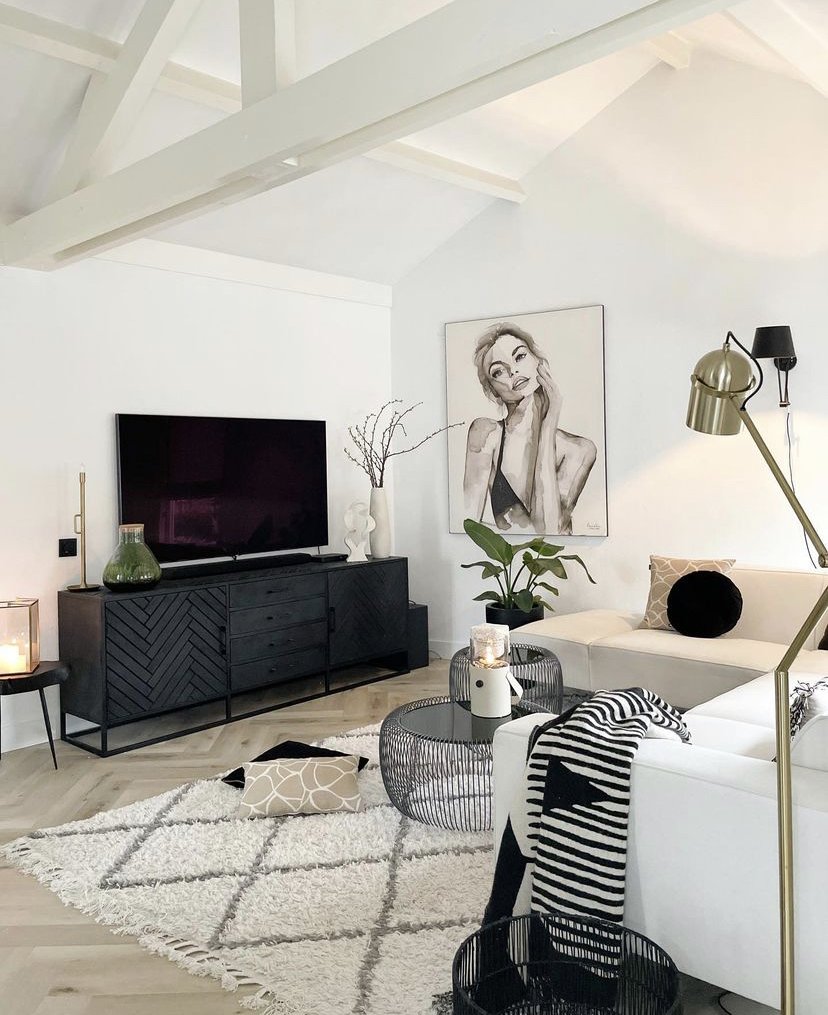
We all love a good Netflix binge, but when you have removed lots of walls, you suddenly realise you have a problem - where’s the TV going to go? The answer is most probably one of the remaining walls, but bear in mind that that will dictate the arrangement of the sofas. If you were hoping to look out the bifold doors to the garden from the sofa, you might need to rethink! Look at the possibilities for the TV position, and you might find this determines the furniture zones. It can work, but only if you plan for it early on.
If you need some friendly expert help in your home, take a look at our design packages. We have decades of experience in overcoming all sorts of design dilemmas, and can give you the confidence to move forward with changes in your home. Our bespoke package is designed specifically for open plan, multifunctional spaces and the challenges they throw up. Book a free Discovery Call and see how we can help you today.
You might also like

