Case Study - Open Plan Kitchen/Dining/Living Room
Written by Rebecca Connolly
How we used layout planning to successfully design a huge open plan kitchen/dining/living room to create a multifunctional family space.
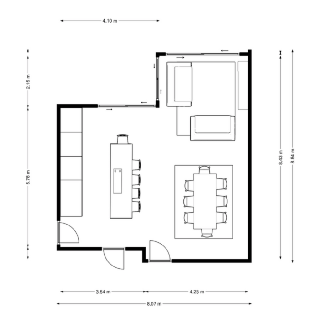
A few months ago we worked with a lovely family who were in the final stages of a large kitchen extension. Although they had chosen the kitchen and the flooring, they needed help visualising and planning the rest of the space. They had three young children and a dog and so the space really needed to be family friendly - durable, easy to clean, clutter free, but also warm and welcoming too. In addition to this they wanted it to be a social space, relaxing, with clean lines and earthy tones. The space was large and open with huge glass doors on three walls. The catalyst for wanting our help was the difficulty in deciding on the best layout and how to zone the space. Although it was really large, it was also really tricky to create the flow they wanted.
Open plan multifunctional spaces are more popular than ever and lots of people want the sociable kitchen diner where they can be cooking dinner whilst spending time with guests or keeping an eye on the kids. These spaces are amazing, often incorporating lovely big kitchen islands and amazing wall to wall windows, however once all the building work is complete you can be left with a huge space and not know how best to use it. You have to consider how shapes will sit together as you could easily end up with a series of rectangular shapes not complementing each other. Or you could have too many hard surfaces together and make the room feel cold and unwelcoming.
At The Living House we always start with the layout as this is really the key to the overall feel and functionality of the space. We spend a lot of time talking to our customers about how they want to use the room as well as who is going to be using it. By nailing the layout early it means narrowing down the vast array of furniture options out there. There are millions of different dining tables, however if you know that the optimum size for the space is 200cm x 90cm then you can really focus your search.
For this customer our first task was to identify possible layout options for the dining room and living room parts of the space. We came up with two ideas that offered something different. The main consideration was the bifold doors. Wall to wall windows are great, they really bring the outside in and look fantastic, however they do mean you lose a wall to put furniture against - and in this instance there were three walls of windows!
Initially we needed to figure out whether the space near the garden should be the dining area or the living area. And importantly, with so many glass walls, where would the TV go?! The benefits of Layout 1 was that the TV could be positioned opposite the sofa and was visible from the kitchen area. It allowed for space for armchairs, and having the upholstery in this part of the room softened the look as you walked into the kitchen - otherwise with the kitchen counter, large kitchen island and then a large rectangular dining table all lined up, there were a lot of hard similar shapes together, as you can see in Layout 2. In Layout 2 the TV was on the wall opposite the sofa near the garden end of the room. However the positioning of the corner sofa was slightly awkward to allow room to walk around it and actually meant you looked into the room, rather than out at the garden.
The great thing about this process was that we got feedback from our customers throughout so we were able to show them some initial layouts and see their thoughts - after all they are the ones who will be living in the space! Our customers liked aspects of both but commented that the most important thing to them was having a space where they could sit and read and drink coffee near the bifold doors and the garden. By showing a few options it unearthed something important to the customer that may have been overlooked if they had just purchased furniture without considering all the options and how they really wanted to use the space.
So we got to work on some more options with this in mind. The customers decided they preferred two sofas instead of a corner sofa. To allow for flexibility in the future, they put in extra sockets and TV points to allow for further changes down the line.
Are you overwhelmed by the amount of decisions you need to make? We can help with our affordable interior packages - click here.
With the general layout decided, it was time to bring interest and style to the room. As we mentioned earlier it can be particularly difficult to design open plan spaces as all the furniture has to work together even though you are in effect dealing with three different rooms. Choosing items such as a rug becomes tricky when you have two in the same area and takes really careful consideration.
Tip: have one rug which is a pattern such as a berber rug or a distressed traditional design and keep the other one simple. Jute rugs go with just about anything and work well in open plan spaces.
Are you struggling to imagine how it can all work together and get the flow right in your dual function room? Click here
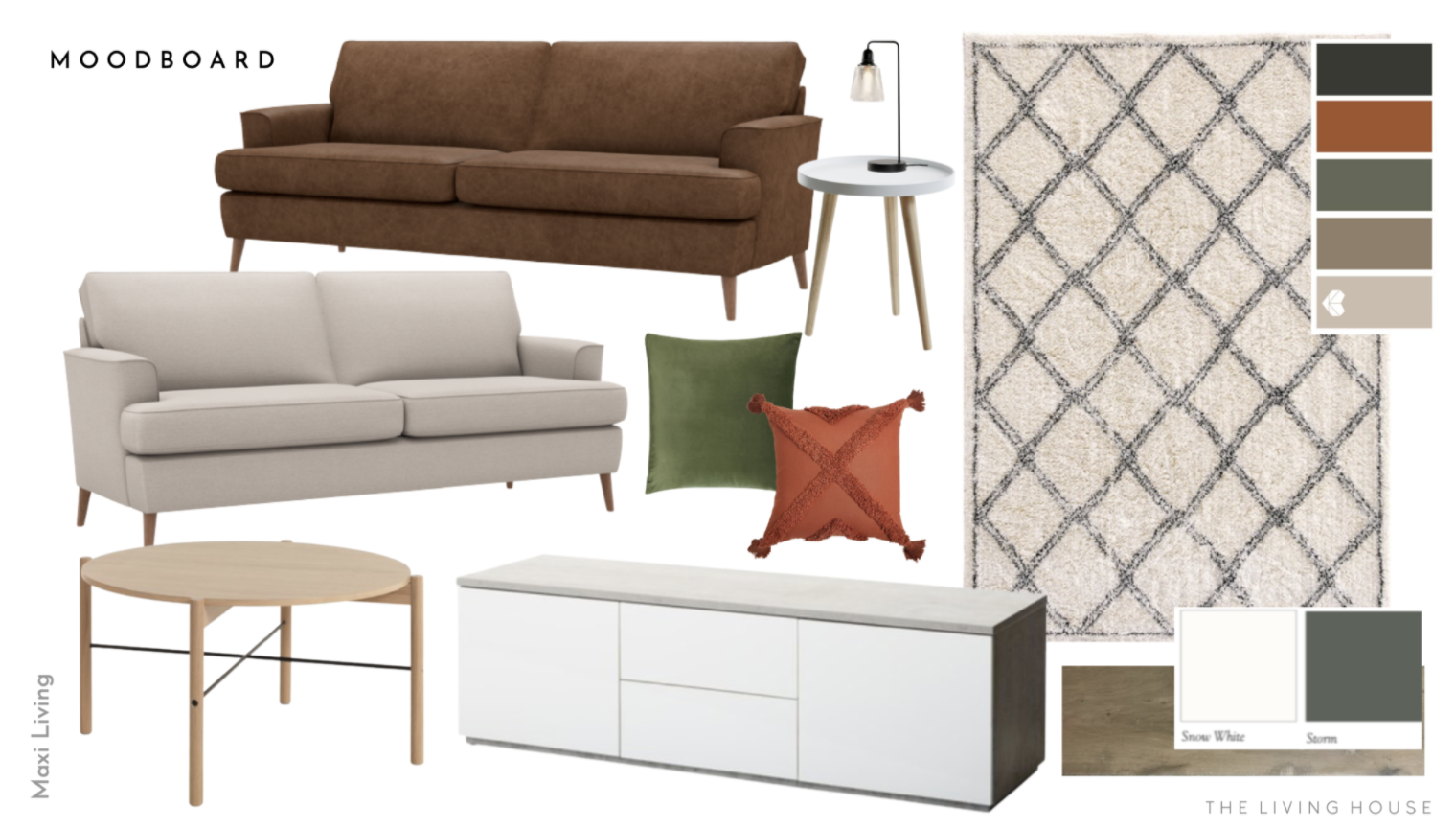
The soft berber style rug was placed in the living area of the room as it was cosy and zoned this space really well whilst keeping the colours light and bright. The area needed a focal point so we added a lovely modern tv unit which had some hidden storage to keep things tidy. With the sofas we decided to mix up the fabrics in the space to add interest. We kept continuity by having the same style of sofa, but changed the sizes and fabric to keep it from looking too matched.
To give balance to the dining area, a sideboard was added to the long wall opposite the kitchen. In the future the customers wanted to add a mirror or artwork above the sideboard to add extra interest and colour. Mirrors also work really well to bounce light around a room, especially in spaces further away from the windows.
We went for a mix of dining chairs - 2 green leather at the ends of the table, and 4 white and oak chairs. This added contrast and gave this area a unique look. We also added a small woven top bench behind the leather sofa to work as additional seating when the table was extended. The bench behind the sofa also helped to zone the space.
We created a design for our customers which felt both classic and contemporary. The colour palette was kept muted but warm, and the finish of the items was wood, leather, black metal and white. This neutral base allowed the customer to bring in colour with the accessories and artwork, and could be changed over time.
Have a chat with us and find out how we can help you. Book a discovery call with us today!
If you would like some help updating your home, and figuring out how to overcome the challenges in the room, please get in touch. We’d love to hear from you and create a beautiful scheme personalised to your style and budget.


