How to bring the Scandi style into your home
Written by Catherine Seagrave
Maybe the enduring appeal of Scandinavian design comes down to the fact that it is so clever. It manages to encompass complete opposites with ease, appealing equally on a warm summer's day as on a cold wintery evening. It is simple and minimalist and yet cosy and comfortable, it is incredibly stylish whilst remaining enduringly practical.
At its heart though, Scandi design provides the number one thing that we all want from our homes - for it to feel cosy and welcoming.
Our love of all things Scandi isn’t new. The idea of a simple, calm home that is comfortable and practical is pretty universally appealing. Who doesn’t want a functional home that is also beautiful? A home that has a place for everything and exudes calm? I know I do!
We all know how a Scandi room should feel but achieving that effortlessly simple and beautiful look we see on Instagram can be tricky to pull off. Without care it can look cold or harsh, clinical and even a bit soulless. Here are our top tricks to get a simple, sophisticated look that keeps your home a million miles away from cold and uninviting!
Use the colour palette of nature
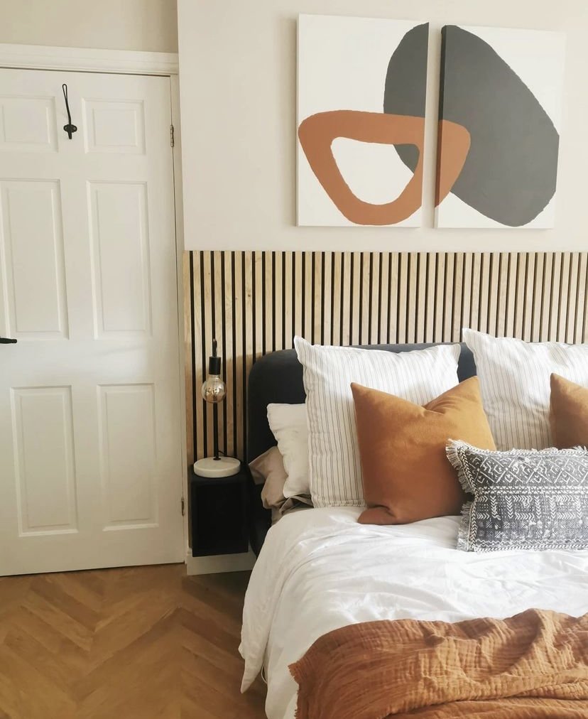
When you think about Scandinavian design, the first thing you notice is the soft neutral colour palette, heavily influenced by the great outdoors. Bringing the feel of nature inside, gives a sense of calm and creates a wonderful neutral background. Colours in this part of the world are muted and gentle. Inspiration is taken from stone, wood, the earth, the clouds, and even the rain. These muted tones work harmoniously together to create a timeless look that will never go out of style. Grey blues and shades of off white, with limestone and pebble colours, accented with gentle pink, and washed out ochres make for a very liveable colour palette that you won’t tire of and is not overwhelming.
In a Scandi room, the beauty of nature shines through and is appreciated. The grain of the wood is a feature and is never camouflaged with paint or wood stain. Leather is used as an accent colour, adding the warmth of tan and sunny sepia tones. Pops of green are added with lots of plants to soften and bring life to the colour palette.
How do I achieve a natural colour palette?
Use only the colours you find in nature - and in the Scandinavian countries. The light here is greyer and weaker than further south. Stick with a mix of unsaturated muted tones of grey, beige, gentle blues and greens and lots of white tones.
We can shop from anywhere to suit your style and budget. Click here to get started.
Declutter, declutter, declutter!
One thing that Scandinavian design is not is cluttered. There is little visual clutter, instead favouring the purposeful placement of selected objects. Fitted carpet is never used. Instead wood floors add to the clean lines and open feel. The empty space between objects is important, allowing each item space to breathe, and creating a sense of calm.
So how much is too much? This is down to personal preference, but every addition needs to be carefully considered and needs to have a purpose. Each item needs to earn its keep and preferably have more than one function - a bench seat with storage, a coffee table that can also be a stool.
That is not to say that it should be stark. Pattern and colour can be added sparingly on accent cushions and rugs, until you feel you have just enough. Just select with purpose and care, and beware the clutter that builds!
How do I declutter?
Take everything that doesn’t belong in the room out, and then remove all the accessories and extra bits. Add items back in one at a time, and really consider if you love it and if you need it. In the case of Scandi design, less is definitely more - allow each item space to shine.
Use contrasts
When everything is simple, muted and pale, Scandi design relies on contrast to add interest. This doesn’t mean adding a bright contrasting colour, or a feature wall, but instead using contrasting shapes, textures, sizes and even different ages in the items you choose. This contrast is needed to balance the understated simplcity, and ensure that the room is also striking.
In a room where all the furniture is new, adding an old wood chair will bring contrast. Equally if all your furniture has clean lines and hard surfaces, a rounded shape armchair, or a sheepskin rug will visually break up the look.
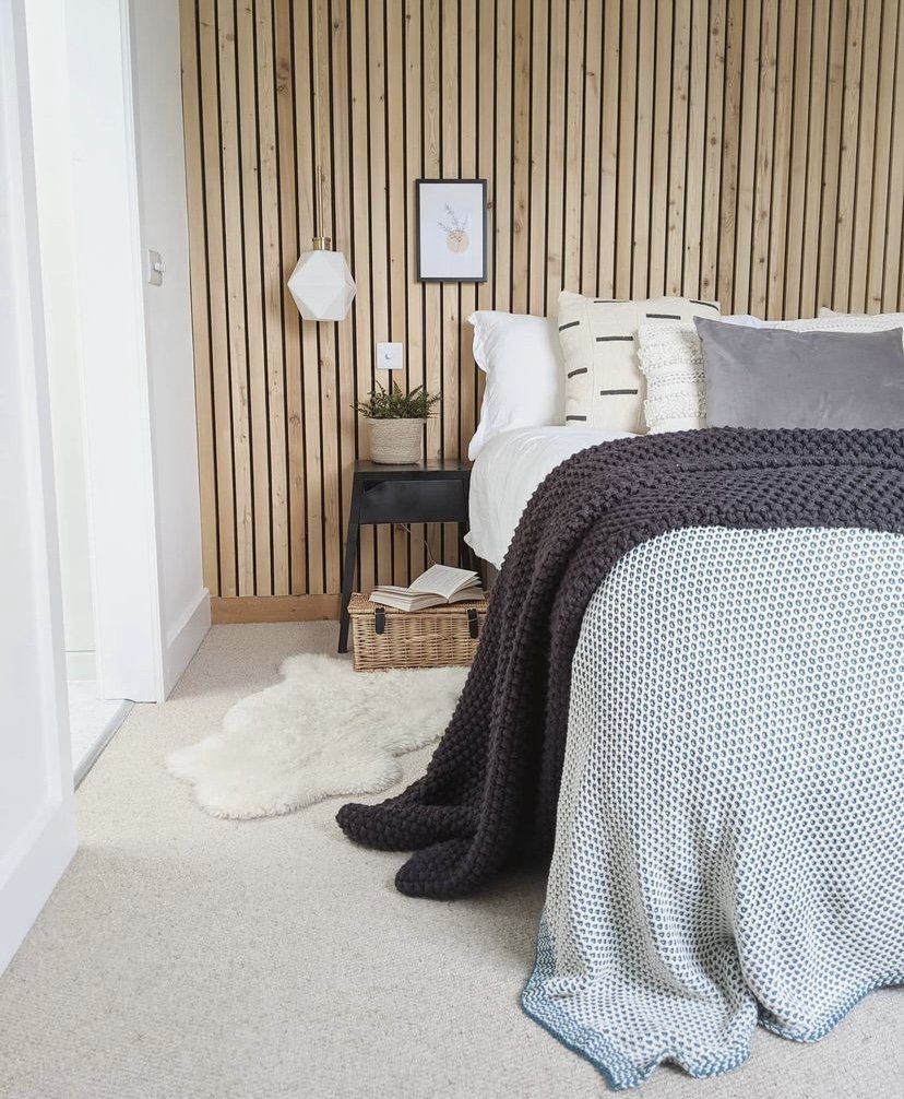
Contrasts can also be found in the size of an object. A large decorative vase will have more impact where other accessories are small. Where the furniture is more utility and purposeful, add cosiness with texture like a chunky knitted blanket. Contrast can also come from adding pattern. Geometric patterns on a rug, simple florals designs on a curtain or even black and white photos can add just enough contrast.
How do I add contrast?
Look at what you have in the room. What are the main shapes? Are they mainly rectangles? Then add some organic shapes, or circles with a round mirror, a curvy vase or an irregular shaped sheepskin. If everything is new, find something old that you could add - it could be as simple as a decorative box, or a weathered terracotta plant pot. If most of your surfaces are smooth, add texture with a chunky knit cushion or a jute rug. Do you have any pattern in the room? You could add a geometric print on a couple of cushions.
Are you overwhelmed by the amount of decisions you need to make? We can help with our affordable interior packages - click here.
Bring nature in
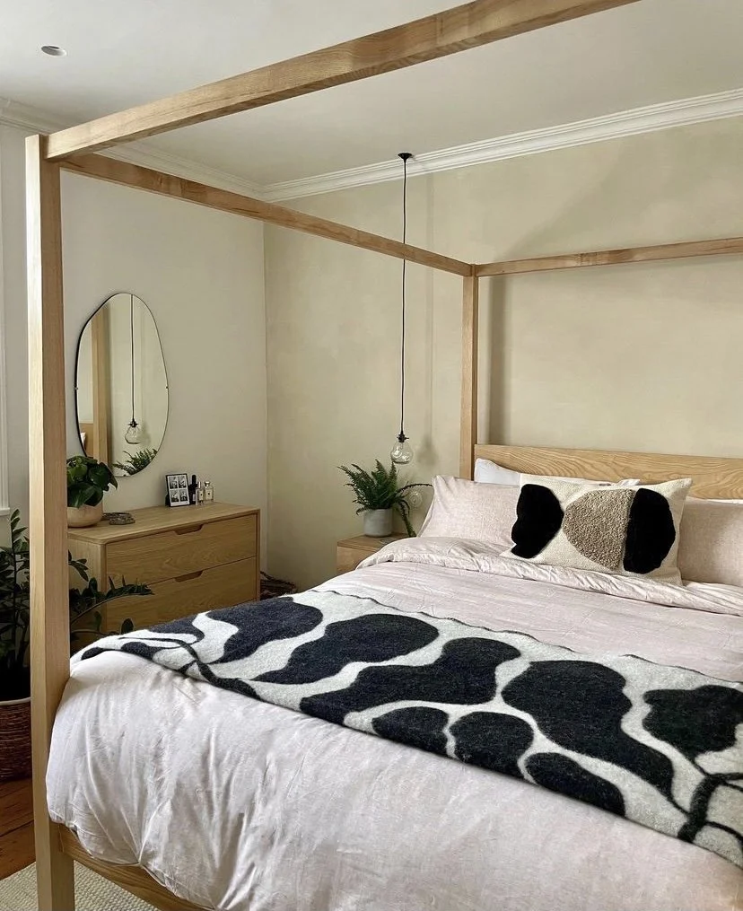
A key Scandi principle is to use as many natural elements in the room as possible. As well as the colour palette reflecting nature, the items in the room are also made from natural materials. Light wood is always a main feature, as is wool, leather, linen and jute. Wood is often used not only on the furniture, but as a feature on the walls and the ceiling, bringing warmth, colour and pattern. Texture comes from these natural materials, celebrating what is unique and irregular about them.
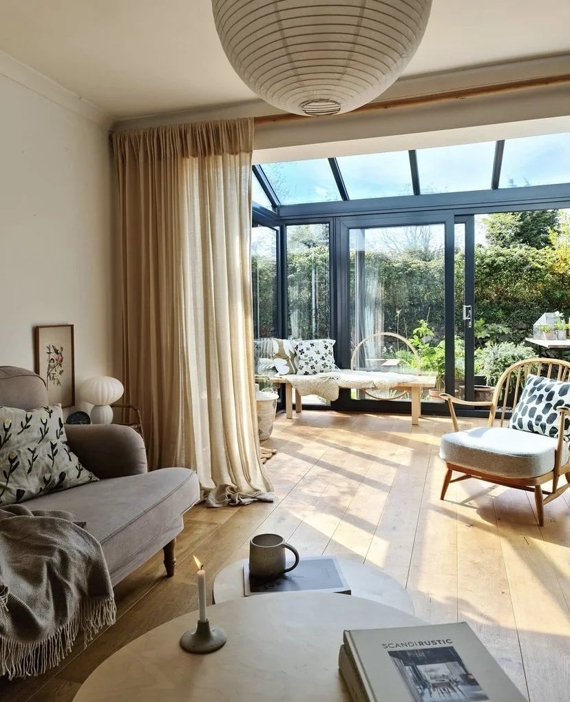
Curtains are kept minimal and simple, and are pulled back from the windows to maximise the light and make the most of the views, bringing as much of the outside in as possible. Large plants are placed near the windows to blur these lines between inside and outside.
The quality of every element is very important. The craftsmanship should be evident in the design, shying away from mass produced items in favour of eco friendly and sustainable methods. Scandi design isn’t about fast fashion, but high quality, crafted, unfussy pieces that will last you a lifetime.
How do I bring nature in?
Swap heavy curtains and blinds for simple linen curtains that can be pulled clear of the window to maximise the light. Look for natural fabrics, wool throws and leather armchairs. Buy the best quality items you can afford and aim to keep them for a long time. And add lots of plants - real of course!
Add Hygge
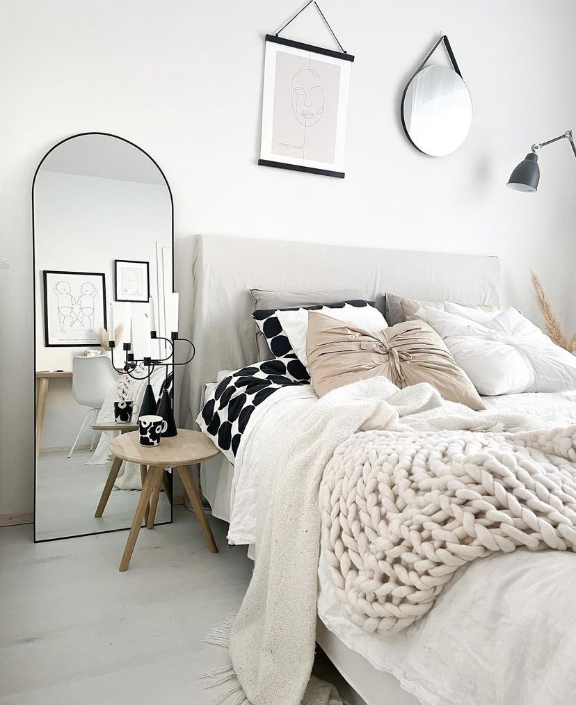
Scandi design takes comfort very seriously. Home needs to feel like ‘home’. The coolness, clean lines and pared back look is softened by texture and colour. It exudes a sense of warmth and comfort, of cosying up on cold days, and shutting out the world. Candles and blankets and open fires contrast beautifully with the simplicity and restraint of the design.
The layout of the room is important here too. You want to create cosy areas for reading, welcoming corners to sit and have a conversation. And comfortable places for taking a nap. Group chairs together, add stools that can be moved around and add rugs to visually define different areas in the room.
How do I add Hygge?
Layer textures with chunky cable knits and wool throws and blankets, light lots of candles, and add fairy lights. Make the room as cosy, comfortable and social as possible (without being cluttered!).
Have a chat with us and find out how we can help you. Book a free discovery call with us today!
Scandi design never goes out of style as it is simple, beautiful and functional. It is about quality and craftsmanship, and recognising the beauty in nature, and surrounding ourselves with comfort and warmth. A winning combination we can all enjoy - even if the closest to Scandinavia we will ever get is IKEA!
If you would like help updating a space in your home, get in touch! We know that designing a room can be daunting, and we’d love to help by sharing our tips and tricks with you. You could be transforming your room and making it feel as cosy and welcoming as possible in no time with our personalised help and advice.


