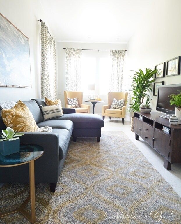
Top tips on how to design your rectangular living room
Written by Catherine Seagrave
This is a really common problem with these shaped rooms, especially in new builds. We get asked for help with layouts often and for good reason. It’s tricky to get right!!
We’ve been working with a lovely customer this week who has a new build house with a long rectangular living room. She was desperate to get away from the corridor effect in the room - lining up the sofas and TV on the long walls, but didn’t know what else to do.
This is a really common problem with these shaped rooms, especially in new builds. We get asked for help with layouts often and for good reason. It’s tricky to get right!!
Long narrow rooms often have lots of extra obstacles too - double entrance doors, French doors out to the garden, fireplaces and windows which can make furniture planning really tough. Add a large TV and general family clutter into the mix, and it becomes a real headache!
But there are ways that you can make this shape room work for you and avoid creating the long tunnel look. Here are our top tips to getting it right:
Struggling with layout?
We can help
The Layout Fix
We’ll help you find the perfect layout so your room finally feels just right.
Decide on the function of the room
It’s best to start right at the beginning. Sit back and think about what you want the room to do for you. Do all the family use the room? Do you like to watch movies together on one big sofa? Do you need a work area? Or maybe you’d like a separate corner to sit and look out the window with a cup of coffee? Every family is different.
Once you have an idea of what the function of the living room will be, you can think about how best to arrange the furniture to achieve this.
Create zones
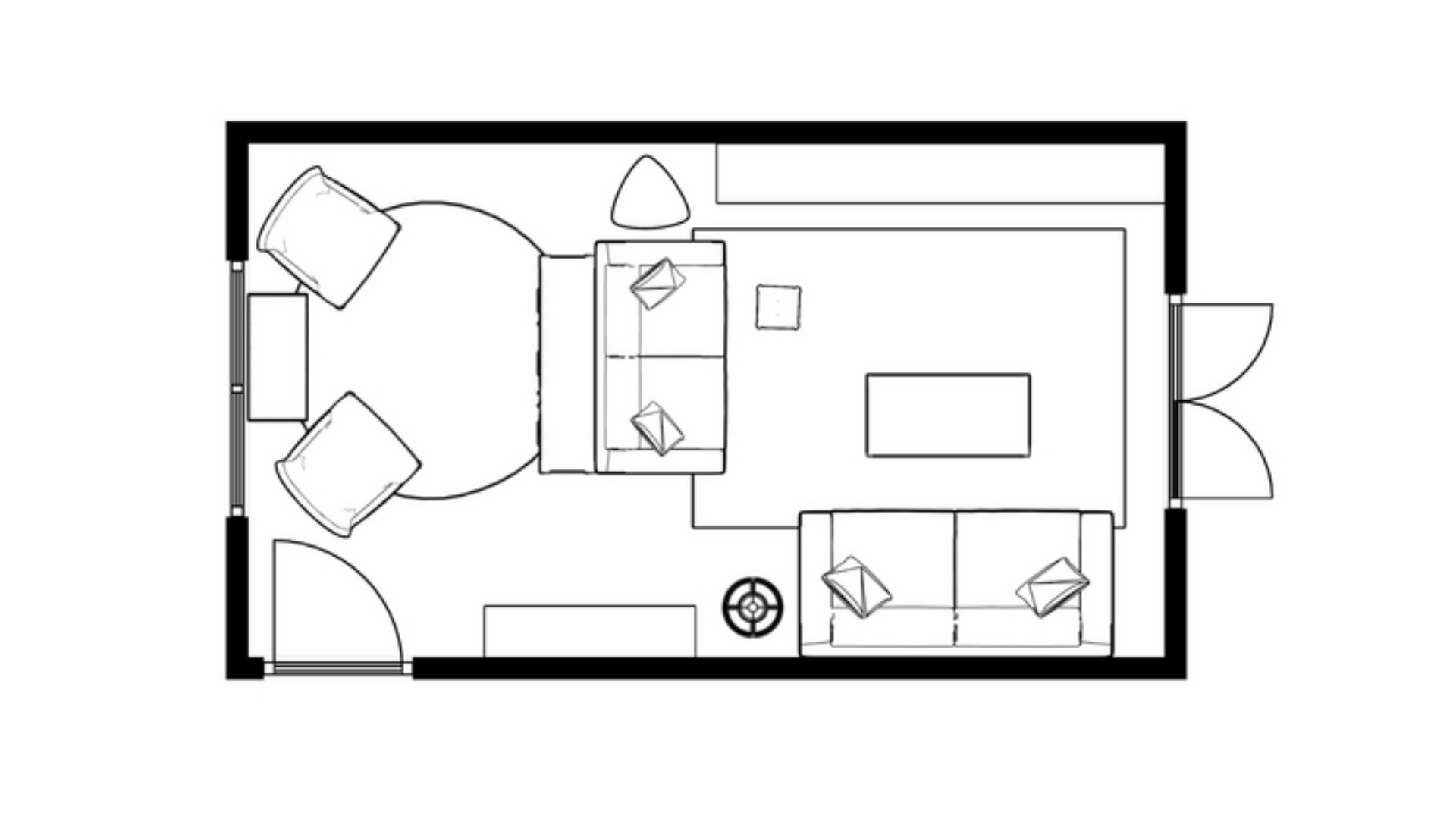
This is really important. Rather than thinking of your room as one long space, think of it more like an open plan space where you can section off different zones. It gives the opportunity to create smaller areas perfect for little reading nooks, or work spaces.
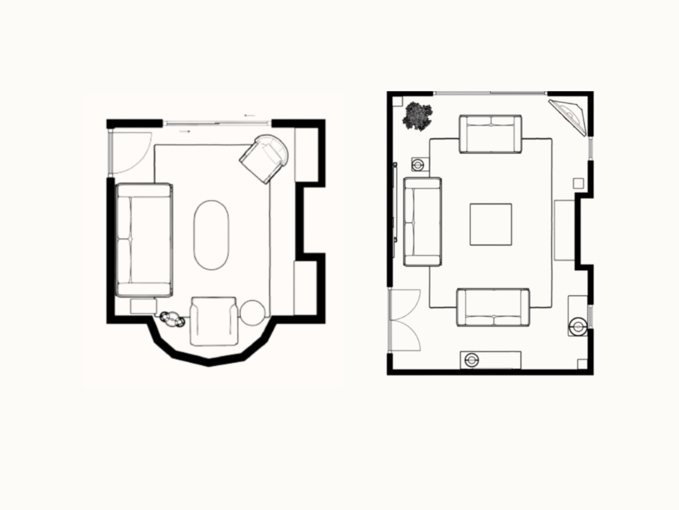
Most people do want to position their largest sofa opposite the TV - because lets face it, that's what most of us do in our living rooms most of the time! But once you have this TV area in place, you have space at either end to create something different. The fixed items in the room (fireplace, doors, windows) will determine where the main TV can be - it might make sense to have this in the middle of the room, leaving the ends free.
A corner sofa can be a great addition to maximise the space and divide the room. Sometimes these work well in the middle of the room to create a zone, with smaller zones at either end, depending on your family's needs.
Look for a focal point
Some rooms are lucky enough to have an obvious focal point to draw your attention in the room. This could be a picture window or a fireplace to act as the anchor for your furniture arrangement.
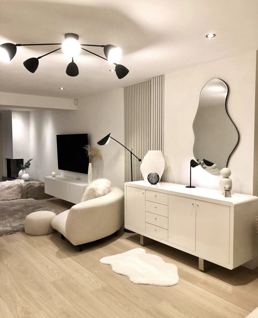
New builds often lack these additions. But rather than seeing it as a disadvantage, see it as something you are free to create. The focal point could be a large media unit, or a beautiful painting. A well placed mirror can also provide this, as well as helping to make the space look bigger.
Use furniture across the width of the room
A mistake that people often make when designing their rectangular living room is to position the furniture along the long walls, with the idea that it will create more floor space. With this same idea, people think a narrow rug or coffee table will make it feel roomier, but it can actually have the opposite effect, bringing your eye inwards.
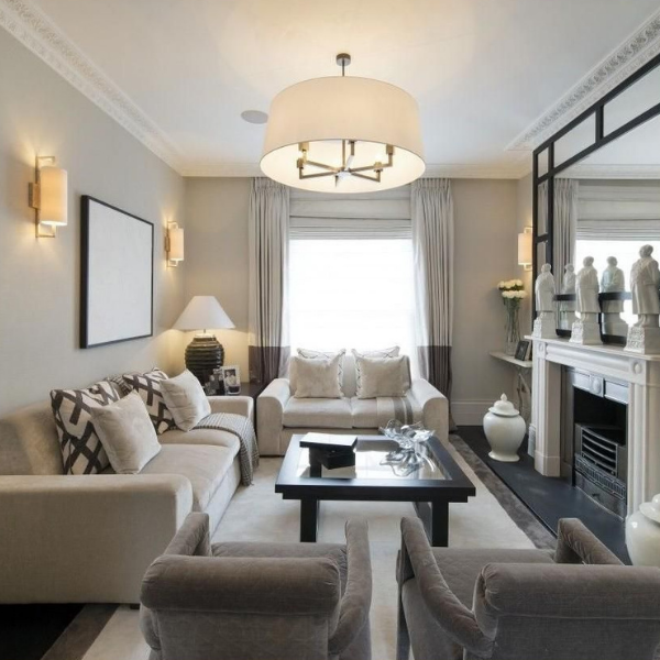
Instead try placing your sofa across the width of the room. This will break up the long lines of the space, pushing your walls outward, and making it feel wider. So that the sofa doesn't feel abandoned in the middle of the room, add a narrow console and lamps behind the sofa. Normally you would have a wall behind you, and psychologically this makes you feel secure - nothing creeping up on you!! A console table or sideboard acts like a wall and can make you feel more relaxed.
Make use of the corners
Now that you have the largest, main pieces of furniture in position, you can think about the corners. Depending on how you want to use the room, this is where you are going to position your desk, or your armchair. Placing an armchair or two in the corner, with a small coffee table, creates a cosy reading area. Add smaller, interesting pieces of furniture around the room rather than filling it with large, chunky pieces.
If you have limited space, it might be an opportunity to add storage, with shelves or a cupboard. Storage with closed doors is always handy and keeps the room from gathering too much clutter. Alternatively, use baskets to hide things away.
Use rugs to define the area
With the function of your room and the zones decided, it’s worth bringing in some rugs. These more than anything help to really define the areas. Make them as large as possible in each space - ideally going under the legs of the furniture to visually tie it all together. Often mixing different shapes works well - a large rectangular rug in the TV sofa area, and a smaller round rug in the snug armchair area for example. This dividing of the room stops your eye from seeing it as one long space.
It’s best not to match the rugs, otherwise it doesn’t have the effect of breaking up the space - much like carpet. Mix the textures, colours or shapes for maximum effect.
Create height
Breaking up the lines in the room helps to disrupt the long narrow space. Adding height makes your eye move around the room in a more interesting way. You can achieve this with a tall shelving unit, or wall art. Adding an interesting pendant light can also make your eye look upwards.
Using colour and pattern on the walls
Colour can help visually change the look of your room. A darker colour on the end walls will shorten the length of the room, bringing these walls towards you. Don’t be tempted to make the long wall the feature wall with a bold colour or wallpaper as this will only make the room feel more narrow.
However, if you do want to add something different to the long walls, colour blocking can work. Used in the right way it can help define the different zones, and break up the space. Triangles and curves work particularly well.
Mix up the shapes in the room
Your room is obviously rectangular, and most likely so are your sofas, sideboard and TV. Introducing different shapes softens this, and again draws attention away from the rectangles. Using circles is a great way to mix this up with a round coffee table, mirror, or rug. And when space is tight something circular is easier to walk around.
If you would like help with your rectangular living room, get in touch. There’s lots of ways we can help - with a full redesign, or just rejigging what you have. Drop us an email with some photos, and we’ll get back to you with the best way forward.

