Interior Design Q & A, part 3
Written by Catherine Seagrave
Everyday we meet lovely customers and chat to them about their homes, and their design problems and dilemmas. And although every customer and every home is unique, there are also themes to the questions that we get asked. Below we have answered 5 questions that have cropped up recently in our chats to customers.
1. I want to decorate my kids room but don’t want to have to redo it every couple of years as their tastes change. How can I design a bedroom for them that will have longevity but still feel personal to their interests now?
This can be a tricky one when you are under pressure for a full on Paw Patrol, football or unicorn theme! Children can be very certain of how they want their bedroom to look right now, whilst you are mindful of how fast they grow and change - and just how many times you want to replace the wallpaper!
Our top tip for designing a room that grows with them is to start with a neutral base. Keep the main colour on the walls and furniture light and simple so that you can add to it. You can then personalise with large wall stickers that make a statement and can be removed. Take a look at Icon Wallstickers for everything from mermaids to monsters to add an instant splash of fun. Large prints of their favourite characters can be changed easily as they grow.
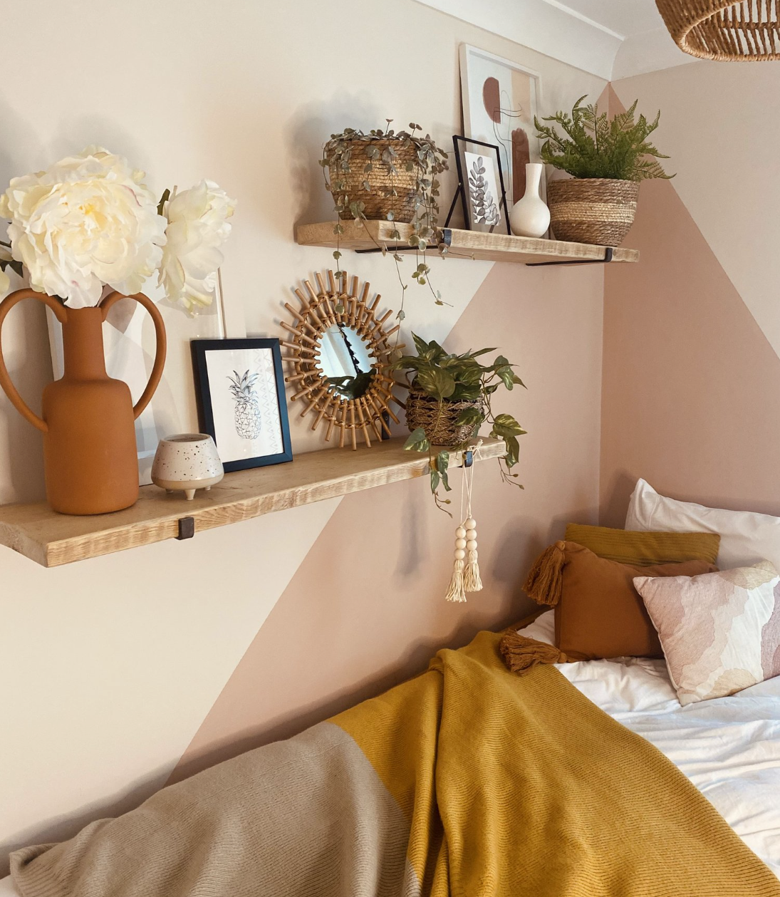
Colour blocking with paint in the room can be a great way to create a cosy den area, or highlight a desk area. Take a look at this blog to see how we used colour blocking for a modern (and non permanent!) look in a teen bedroom.
And finally really think about how your child is going to use the space now and in the future. Do they need a desk for crafts now and homework in a few years? Do they need space to play with toys and to lounge on bean bags in a few years? Will they want to play on their Xbox in their room? Considering these shifting habits and behaviours will help you create a room that works now, and in the future.
Do you struggle to visualise how your room could look? Let us help you, click here.
2. I want a really wow statement ceiling light in my kitchen extension. Do you know where I could look for one?
Yes, definitely! If you’re considering a statement light, then go as large as you can for impact. If you can’t go large, then use multiples of the same light - three always looks good. Do be aware of the height of your ceiling too - this might limit your options to a more flush fitting. Budget is obviously a big consideration when choosing where to look as a statement light can run into thousands. However, there are cheaper alternatives around which are really pretty good. It’s definitely worth taking a look at B&Q, Dunelm and even Robert Dyas.
Below are four different ideas for statement lights to get you started.
This beautiful chandelier from Pooky would look amazing in a very modern, white and marble kitchen. The grandeur would contrast perfectly with the minimal look of the units. Capulet chandelier £895.
Rockett St George are great at the quirky and unexpected, and this feather light is no exception! The feathers give a soft and ethereal quality that would look fab over a table. Gloria £595.
B&Q have some very well priced lighting that is also surprisingly good! This back and gold light would add a bit of industrial glam to your kitchen, at a price that won’t break the bank. Monzoni £64.
This choice from Lights & Lamps would also be a great contender. Feeling both masculine and feminine with its sharp lines and soft egg shape shades, it would fit the bill if you were after something contemporary and stylish. Imperial £199.
If you’re thinking of extending your kitchen take a look at this blog ‘The 6 most common mistakes we see when people extend their home’.
3. My downstairs loo is a small white box. How can I add some personality?
Your downstairs loo is the perfect place to let loose and make a statement! You can afford to be fearless and have a bit of fun here as you shut the door on the loo most of the time - although you might find you love it so much you want to keep the door open!
A good place to start is the walls. Pick a bold and vibrant wallpaper for an instant burst of personality. Take a look at Lust Home for some inspiration. We especially like their Plantopia wallpaper in Space Blue for some leafy brightness.
We can shop from anywhere to suit your style and budget. Click here to get started.
Another good place to look is John Lewis for a great selection of wallpapers with free samples you can try at home.
Downstairs loo’s are also a great place to display collections. Maybe you or your partner has a quirky collection of concert tickets, travel memorabilia, or sporting trophies. Show them off to the full in your downstairs loo!
For more ideas take a look at the blog “What are the rules for decorating a downstairs loo? The rules are - there are no rules!’.
4. My living room feels cold and unwelcoming for a lot of the day. It doesn’t make us want to use it. What paint colour can I use to warm it up?
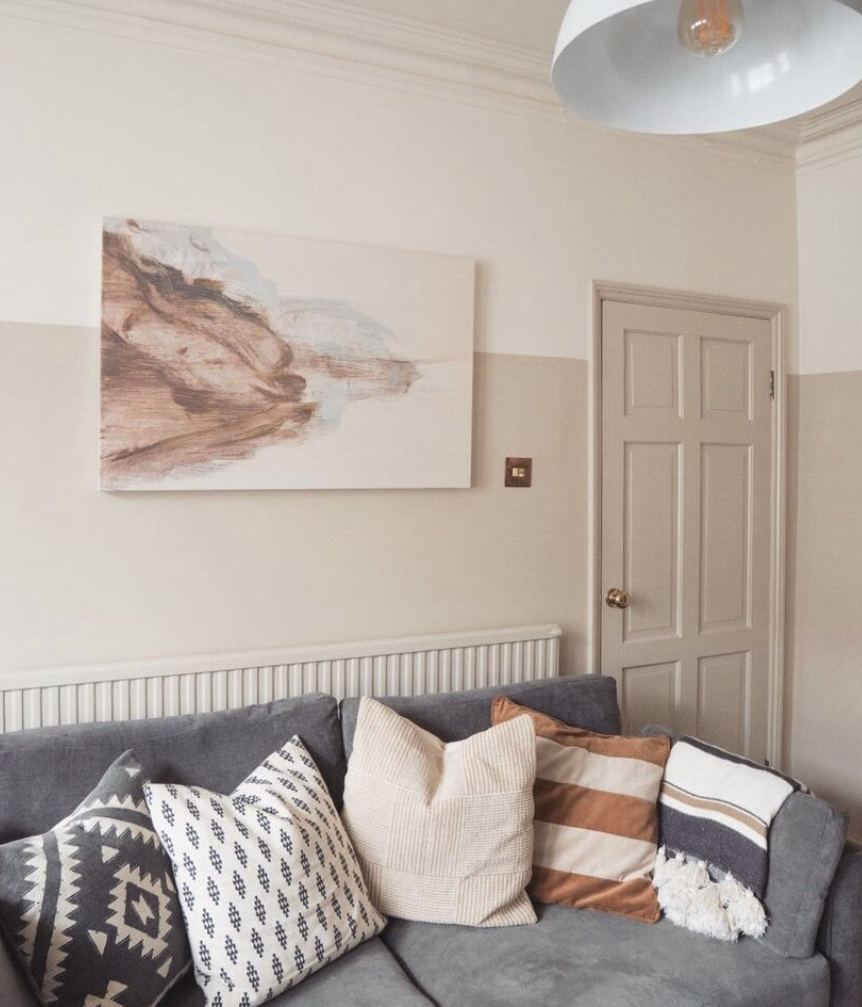
It sounds like your room is north facing meaning the light in the room isn’t very bright and has colder blue undertones. This can make the room feel chilly on even the sunniest day. The choice of colour is really important as anything with a blue or grey undertone will make the room feel even more unwelcoming. You are wanting to look for colours that have red and yellow in their undertones. That doesn’t mean opting for red walls! You can still have white, light colours, but you want to choose one that leans towards the warm tones rather than the cold. Dimity by Farrow and Ball is a perfect example of a warm white. It is a very light taupe, brimming with warmth.
Take a look at our ‘Choosing the best white paints’ blog that lists the best warm whites that we use over and over and would be ideal in a north facing room.
Have a chat with us and find out how we can help you. Book a discovery call with us today!
5. Is the feature wall dead? Is it old fashioned now?
The answer to this is yes and no… The feature wall where the chimney breast is painted red or purple in contrast to the rest of the room is definitely feeling dated. I’m not sure it was ever such a good idea anyway, as putting a bold colour on the narrowest part of the room was only going to make it feel narrower.
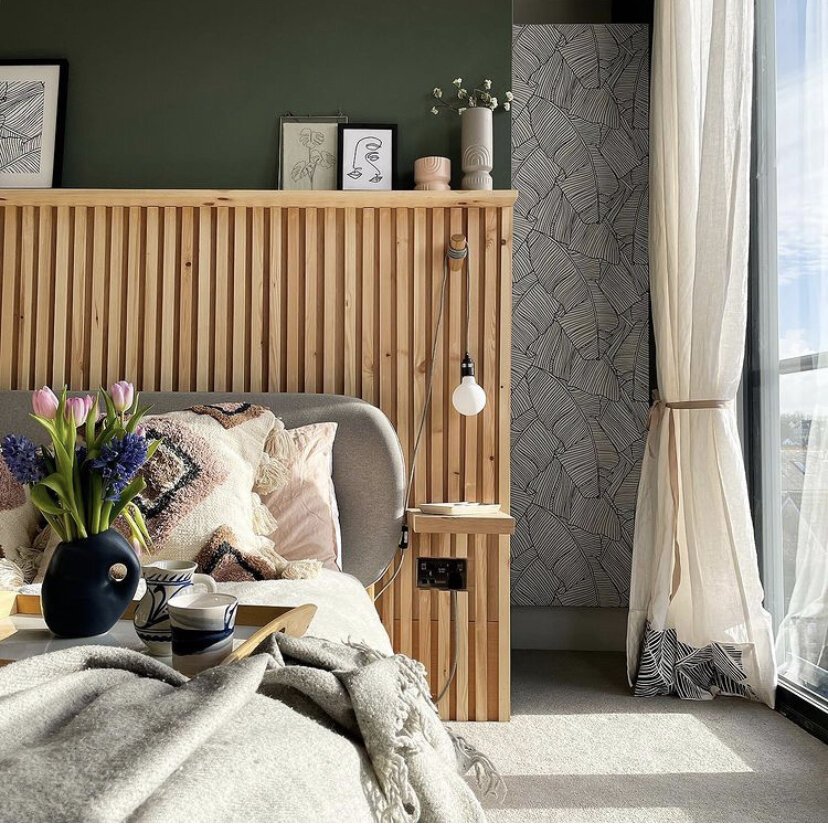
However the idea of choosing a wall as a feature will never go out of fashion as it adds interest and personality, when done in the right way. The trick is to work out why you want to highlight a certain area. Do you want to create an office nook in the room? Then painting the desk area a different colour would create definition and help to zone it. Does the dining area in your kitchen feel a little plain? Then a bold wallpaper on one wall would draw your eye and give the area more personality. Or maybe your new build living room lacks features? Then a wood slat feature wall behind the TV would be just the thing to add warmth and character.
So the feature wall is definitely not dead. It’s just adapted over time and if anything it’s got bolder and broken free of the chimney breast!!
If you’d like some ideas on how to use wallpaper to add interest to your home, check out the blog ‘How a roll of wallpaper can add personality to your room’. Or if you are after some colour blocking inspiration take a look at ‘How to use colour blocking in your home’.
If you need some friendly expert help in your home, take a look at our design packages. We have decades of experience in overcoming all sorts of design dilemmas, and can give you the confidence to move forward with changes in your home. Book a free Discovery Call and see how we can help you today.
You might also like


